What Is Taste in Generated UI?
What beauty and taste mean when models generate UI
TL;DR
AI-generated interfaces are becoming more polished, and we increasingly describe a model as having “better taste.” What does that judgment mean? Even beauty involves several judgments: the same interface can feel restrained to one viewer and empty to another, while knowing its audience and purpose changes how we see it. A clear brief can still admit several good designs. Taste involves choosing among those possibilities: recognizing their merits and tradeoffs, responding to the situation, and making the choices work as a coherent whole. Familiar forms can help people understand an interface; new forms can give it an appropriate expression. Both require judgment.
This complicates training models to have taste. The examples we select and the people whose preferences we use shape what a model learns. Training can reduce layout defects and improve appeal while encouraging repeated use of a style that reliably wins approval. More attractive or novel output therefore demonstrates only part of the progress. To assess taste, we also need to see whether choices change appropriately with the product, audience, or content, including which conventions remain useful. Existing research shows ways to improve appearance and satisfy particular preferences. Developing judgment that works across contexts remains an open problem.
Frontend generation has become one of the clearest places to see foundation models improving. Earlier evaluations could ask whether a model produced valid HTML, built a React project, rendered the page, and connected controls to state. Current systems increasingly deliver complete interfaces with coherent typography, hierarchy, spacing, imagery, and interaction on the first attempt. In an agentic loop, the harness can open the page and capture its rendered state, while a multimodal model interprets that observation and proposes revisions. OpenAI presents this computer-use and rendered-interface refinement as part of GPT-5.6’s frontend gains (OpenAI, 2026). The Kimi K3 report describes complementary improvements inside the model, including training on paired webpage code and renders and reinforcement learning for web-development tasks (Kimi Team, 2026). The visible result can therefore reflect learned model capabilities, system instructions, tools, and repeated execution. The most visible part of that improvement is the changing set of high-probability visual answers. Figure 1 places the earlier purple SaaS shell beside two newer recurring modes that have begun to function as defaults of their own.
Three miniature interfaces compare recurring generated frontend styles. The left is an earlier purple SaaS shell with a dark sidebar, hero masks, and a three-card grid. The middle is a warm cream editorial page with a serif headline, a terracotta gradient emphasis, a sign-in field, an alternate sign-in row, and a field-notes column holding an italic quotation and an annotated line chart. The right is a near-black page where a hand-drawn lighthouse on the right casts a wide beam across the composition, and the word inside that beam is the only lit element.
For much of 2024 and 2025, generated frontend design had a recognizable visual signature. A vague request for a modern landing page often produced a centered hero, purple or indigo gradients, rounded cards, soft shadows, neutral sans-serif typography, and a three-column feature grid. The bundle appeared often enough to become a social category with names such as “AI slop,” “vibe-coded design,” and “Claude style.” Anthropic described this tendency toward Inter, purple gradients, predictable layouts, and minimal animation as distributional convergence around highly represented web patterns (Anthropic, 2025). One memorable origin story focused on Tailwind creator Adam Wathan’s choice of bg-indigo-500 for Tailwind UI buttons. His joke captured a plausible mechanism: widely copied code, documentation, and templates can leave statistical traces in model output (Wathan, 2025). Web-scale evidence complicates that causal story. The 2025 HTTP Archive Web Almanac found substantial growth in purple and indigo across the whole web, while Tailwind-using pages showed no comparable rise after 2022 (HTTP Archive, 2025). Human websites had also become more visually similar before generative coding, shaped by shared libraries, responsive layouts, mobile constraints, and established information architectures (Goree et al., 2021).
By 2026, the purple stereotype had already become incomplete. Anthropic’s current frontend guidance warns about newer recurring styles: warm cream backgrounds with high-contrast serif type and terracotta accents, near-black pages with a single acid color, and broadsheet compositions built from hairline rules, dense columns, and square geometry. It also flags decorative numbering, metric-heavy heroes, repeated page structures, and gratuitous animation. Within months, some visual directions used to escape the earlier stereotype had become frequent enough to need their own anti-default instructions (Anthropic, 2026).
Same-prompt comparisons show that current models can have different surface tendencies while sharing deeper conventions. Across ten one-shot frontend tasks under the same Tailwind-based harness, Kimi K3 repeatedly favored warmer palettes, serif display type, more whitespace, and sparser compositions. Claude Fable 5 more often chose cool blue or cyan accents, sans-serif hierarchies, and denser layouts. A detailed brand specification largely suppressed these differences, and some prompts led both models toward the same warm serif direction. Their page anatomy converged even more often, including similar pricing tables, documentation shells, and SaaS landing-page structures (Kilo, 2026). These recurring choices suggest an effective aesthetic prior: the distribution over design decisions that a system tends to make when the brief leaves palette, typography, density, ornament, or hierarchy open. System prompts, design skills, component libraries, browser feedback, and coding harnesses can all move that distribution.
The improvement from the older AI look is real. Current systems have a broader visual repertoire, follow art direction more closely, handle typography more deliberately, and can use rendered feedback to repair visible problems. Those gains leave open what people mean when they say that a model has developed better taste. An attractive default may reflect stronger design judgment, an updated training distribution, more effective system guidance, or a preference model that has learned which contemporary styles tend to win quick comparisons. A stronger test is whether the system changes its choices appropriately with the product, audience, content, brand, cultural setting, and practical constraints. This places generated UI inside a much older discussion about aesthetics, where calling quality “subjective” compresses several sources of variation into one word. People may notice different formal properties, recognize different historical references, apply different category expectations, possess different levels of expertise, or imagine different audiences and purposes. They may still agree on obvious imbalance or poor contrast while assigning different importance to novelty, familiarity, restraint, ornament, and expressive character. Evaluating whether a model has acquired taste, and deciding what data or feedback could improve it, therefore requires a clearer account of how people have understood beauty, good design, and cultivated judgment.
Where Does Beauty Live?
Calling an interface beautiful seems at first to locate beauty in its visible form. The judgment becomes harder to explain when the same form looks disciplined to one viewer and empty to another, appears fresh in one decade and clichéd in the next, or feels elegant until someone tries to use it. The history of aesthetics is useful here because successive accounts had to explain more of these changes. The object remained important, while the observer, the encounter, learned ways of seeing, and the artifact’s purpose gradually became part of what aesthetic judgment had to consider. Figure 2 holds the artifact constant across five panels and expands the unit of judgment from its internal order to the observer, their response, learned perception, and finally purpose and context.
Five plates set side by side, numbered one through five and labelled order, judgment, response, learned perception, and purpose or context. The first shows a geometric construction alone inside its frame: an inscribed ellipse, both diagonals, the two axes, and a small circle in a reciprocal square at the lower right. The second adds an observer in profile whose lines of sight reach the same construction, now seen at an angle. The third replaces those lines with a soft bundle of warm curves that leaves the eye and gathers again at the centre of the picture. The fourth interposes four evenly stepped translucent planes between observer and picture, two of them carrying a dotted echo of its outline. The fifth hangs the same picture on the wall of a working room, among copy blocks, colour swatches, a chart and a lamp, with a chair drawn up to the desk below.
Beauty as Order
The first place to look is inside the object. In The Ten Books on Architecture, Vitruvius described architecture through order, arrangement, proportion, symmetry, and decor. Symmetry meant commensurability among the parts and between each part and the whole, so a column, room, or facade received its measure from the larger composition (Vitruvius, 1914). This account remains intuitive in interface design: hierarchy, rhythm, balance, and visual unity all concern relationships among parts, and a beautiful component can still weaken the page that contains it.
Birkhoff pushed the same ambition toward formal measurement. In Aesthetic Measure, he proposed $M = O/C$, an aesthetic value defined as order divided by complexity, and applied it to polygons, ornaments, vases, music, and poetry (Birkhoff, 1933). His formula represents an unusually explicit version of a broader hope that the relevant qualities can be found in the artifact and combined. The difficulty is familiar: two people can encounter the same proportions and respond differently, while one viewer can return to a difficult work and discover qualities that were previously unavailable. Relations in the object require someone who perceives them and decides that they matter.
Beauty as Judgment
Once the observer enters the picture, disagreement becomes part of the problem. Hume begins Of the Standard of Taste by locating beauty in the mind that contemplates an object, then asks why some judgments still appear more perceptive than others. Practice lets a critic notice finer features, comparison prevents a modest achievement from appearing exceptional, and freedom from prejudice helps the work be considered from the position of its intended audience. His standard describes how a credible critic is formed: taste already involves trained attention, comparative memory, and the ability to adjust one’s point of view (Hume, 1757).
Kant explains why such a judgment feels different from a private preference. In the Critique of Judgement, pleasure supplies the basis of a judgment of beauty, and no concept can prove in advance that an object must produce it. Calling the object beautiful still asks others to share the response (Kant, 1914). This is why aesthetic disagreement produces reasons, comparisons, and invitations to look again even when no proof can settle it. Once judgment depends on an observer’s response, that response itself becomes something researchers can try to observe.
Beauty as Response
In the nineteenth century, Gustav Fechner proposed an “aesthetics from below” that would study the empirical conditions of immediate pleasure. His Vorschule der Aesthetik discusses experimental methods, including choices among forms, as ways to investigate the laws of liking (Fechner, 1876). D. E. Berlyne later studied how properties such as novelty and complexity relate to responses such as pleasingness and interestingness (Berlyne, 1970). These projects treat beauty as something that happens in an encounter: a stimulus is presented, a response is recorded, and a relationship between them becomes the object of study. Computational aesthetics would later inherit the same ambition in predictive form.
Observation does not make the response self-explanatory. An experiment must decide which reaction to record, and the person producing that reaction already brings categories, memories, and habits of attention. The apparent unit of measurement, one viewer facing one artifact, contains a longer history of learning.
Beauty as Learned Perception
Kendall Walton argued that an artwork’s aesthetic properties partly depend on the category in which a viewer perceives it: a feature that is standard within one category can become expressive, disruptive, or inept within another (Walton, 1970). This is also how style becomes visible. A style consists of choices perceived against a field of alternatives and expectations. Someone can register every color, line, and typeface in an interface while missing the distinctions that make those choices restrained, excessive, conventional, or strange.
Michael Baxandall gives this comparison class a historical setting through the idea often called the “period eye.” Viewers in fifteenth-century Italy brought visual habits acquired from commerce, religious practice, dance, and other parts of social life to the paintings they encountered. Artists could compose for those habits because makers and audiences participated in the same culture of seeing (Baxandall, 1988). Bourdieu widens the account further by showing how education, class, cultural capital, and institutions influence which objects people encounter and which distinctions they learn to value (Bourdieu, 1984). A response can therefore reveal qualities in the artifact while also carrying the category, period, and institutions through which the observer learned to see. For designed artifacts, one more relation matters because an interface is encountered as something to use.
Beauty as Fitness for Purpose
Understanding how a chair carries weight or how a diagram reveals a comparison can change the aesthetic appreciation of its form. Parsons and Carlson call this functional beauty: knowledge of function can become part of aesthetic perception itself (Parsons & Carlson, 2008). An interface adds the same pressure. A visually balanced page can direct attention toward the wrong thing, while an elegant interaction can feel entirely wrong for its audience or setting.
The movement from order to purpose therefore changes what aesthetic judgment takes as its unit. Beauty can be approached through relations within the object, the response of a perceiver, the categories and history that shape perception, and, for designed artifacts, the purpose and situation in which the object is encountered. None of these relations alone settles the judgment. Together they explain how aesthetic experience can be grounded in perceptible features and still change with knowledge, culture, and use.
Disagreement therefore does not reduce aesthetic judgment to private liking. Viewers can offer reasons, compare precedents, and draw attention to properties that others have missed, even when no procedure guarantees convergence. Expertise and context affect what becomes visible and what deserves weight. This is a more useful account of aesthetic plurality than simply calling beauty subjective.
For design, even a rich account of these relations leaves many forms available. Two interfaces can address the same audience, perform the same task, and draw on the same visual tradition while developing very different characters. Aesthetic theory can clarify which relationships deserve attention. It cannot choose a single form or determine where convention should give way to invention. That is where taste enters.
What Would It Mean for a Model to Have Taste?
Most design briefs leave appearance underdetermined. Even when the product, audience, content, and function are clear, many forms could answer the brief well. Taste is the judgment exercised within this space: recognizing which possibilities belong, what each choice gains or sacrifices, and whether a decision can be sustained across the artifact. The clearest place to begin is with conventions, since they provide many of the reasonable possibilities a designer encounters before making anything distinctive.
Conventions Are Useful Defaults
Conventions carry accumulated design knowledge. A checkout flow benefits from a familiar order of fields and actions, while a financial dashboard needs enough continuity with other analytical tools for dense information to remain navigable. Typography, spacing, component structure, and interaction patterns also tell people what kind of artifact they have encountered before they examine its details. These defaults narrow an enormous design space, reduce effort for users, and let designers concentrate on the parts of the product that genuinely require a new answer.
Familiarity and novelty therefore do not form a simple scale from worse to better. In a study of industrial designs, Hekkert, Snelders, and van Wieringen found that typicality and novelty could each contribute positively to aesthetic preference once their negative relationship was accounted for (Hekkert et al., 2003). The study concerns consumer products, so direct transfer to interfaces would overreach. Its result still captures a useful tension: an artifact can remain intelligible as a member of its category while departing from the category enough to become interesting. The warm editorial style from the opening illustrates why typicality can help. For a small ceramics studio, cream paper, serif display type, terracotta accents, and generous whitespace form a sensible default because they quickly suggest material, care, and craft. The harder question is how much the resulting page has learned about this particular studio.
When a Useful Default Becomes Generic
A useful default becomes generic when it responds more strongly to a category than to the particular situation. The ceramics page may look appropriate and polished while remaining interchangeable with pages for many other studios. The same test applies to a SaaS landing page whose centered hero, product mockup, testimonial row, and pricing cards would survive a complete replacement of the company and its content. In both cases, the design has drawn extensively from the genre and incorporated too little information from the actual problem.
This distinction resembles what UX practitioners reported in The GenUI Study: Exploring the Design of Generative UI Tools to Support UX Practitioners and Beyond. The study followed 37 UX-related professionals through week-long projects using a generative UI tool. Participants valued rapid generation for brainstorming and intermediate drafts, while also reporting difficulty steering the output toward exact intentions, limited originality and adaptation, and substantial work in the last mile (Chen et al., 2025). High fidelity could make a broad solution appear finished before the underlying design problem had been resolved.
Making the output unusual does not resolve this problem. An unconventional navigation system, type treatment, or animation can be just as unresponsive to the product as a familiar template. A more useful standard is accountable specificity: a distinctive choice earns its place through a relationship with the content, audience, purpose, context, or internal logic of the artifact. If the ceramics studio makes severe black stoneware in a converted machine shop, those facts might justify a darker palette, harder geometry, rawer photography, or many other departures from the warm editorial default. They do not mechanically determine a style. They give the designer reasons for deciding what to retain and what to change.
Taste Chooses What to Keep and What to Change
Taste is the ability to decide which conventions are worth adopting, which need adjustment, which should be abandoned, and where a deviation belongs. Personal preference can contribute to those decisions, while taste also requires reasons that connect them to the artifact and an awareness of their consequences. Comparative memory helps a designer distinguish restraint from emptiness, a useful precedent from a cliché, or meaningful irregularity from accident. Experience reveals whether a promising local move will strengthen the whole interface or collapse when it meets real content, interaction, and edge cases.
Expertise matters because it changes the distinctions available to judgment. In experiments with abstract visual material, participants with greater art expertise tended to find difficult images more interesting and less confusing, with appraisal contributing differently to their responses (Silvia, 2013). Interface design involves different objects and skills, although the broader implication travels: training can alter what someone is able to notice. A designer may see a weak typographic relationship, a derivative composition, or a grid that will fail under real content before those problems become salient to a casual viewer. Good judgment also accounts for the target audience, whose familiarity and practical needs may deserve more weight than a professional designer’s interest in novelty.
A model with taste could still have recognizable tendencies. The stronger requirement is that its choices respond when the product, audience, content, category, or stakes change. It should preserve familiar patterns when they remain useful, depart from them for reasons grounded in the situation, and recognize when an attractive local choice weakens the whole. Assessing that ability requires more than selecting the most appealing final screenshot. It requires evidence about the visible artifact, the observer making the judgment, and the conditions under which particular design choices should change.
How Do We Evaluate Aesthetic Quality?
Once an interface has been rendered, there are two obvious ways to evaluate it. We can inspect the artifact for properties such as collision, contrast, and balance, or we can ask someone which result looks better. Both approaches can produce a number, although the numbers describe different things. A collision rate records one visible relationship inside the artifact, while a preference score records how a particular observer responded to a particular comparison. Every evaluation therefore constructs an observation process: it determines which parts of the artifact become visible as evidence, who is allowed to judge them, and how those observations become a score.
From Visible Properties to Designed Proxies
Rendering turns the code into a visible object that can be inspected. A browser can expose the positions and dimensions of elements, while the resulting image reveals the actual distribution of color and empty space. AeSlides uses this information to check for distorted aspect ratios, excessive whitespace, element collisions, and visual imbalance (Pan et al., 2026). It approximates collision through overlapping element bounds and estimates balance from the visual center of mass. These definitions cannot recover what the designer intended, though they make a limited set of visible failures consistent enough to count across many artifacts.
Some evaluations try to move beyond visible defects and approximate a broader impression. SlidesGen-Bench measures local text-background contrast, color harmony, colorfulness, and cross-slide visual rhythm, then combines those measurements using weights calibrated against human rankings (Yang et al., 2026). Its evaluator followed the human rankings more closely than the general-purpose VLM judges tested in the study, although the human raters still agreed more closely with one another. Carefully chosen proxies can therefore summarize a meaningful portion of visual competence. The resulting score also carries the researchers’ decision about how much contrast, color, and rhythm should each contribute to the whole.
These examples sit at different points on a spectrum. Overflow, collision, contrast, and some geometric imbalances can be described through visible conditions that are reasonably stable across artifacts. Evaluating alignment, grouping, or spacing rhythm requires more knowledge of how the elements were meant to relate. Originality and appropriateness go further because they depend on which other designs form the comparison, who will use the artifact, and where it will appear. The more interpretation enters the metric, the more the score reflects a theory of what good design consists of.
A Preference Has a Population and a Reference Set
When these broader qualities cannot be captured adequately by a set of proxies, researchers usually ask someone to compare complete artifacts. The earlier discussion of taste already gives us reason to expect disagreement. Evaluation turns that philosophical complication into a practical set of choices about who is asked, what they judge, which alternatives they see, and how their answers are combined.
Who is asked can change the target substantially. In DesignPref, twenty professional designers made 12,000 pairwise judgments of generated UIs, yet their agreement on the winner was low, with a Krippendorff’s alpha of 0.25 (Peng et al., 2025). Their explanations showed that they noticed and weighted density, decoration, visual tone, and the prominence of primary actions differently. A model adapted to one designer predicted that person’s choices better than a model trained on a much larger aggregate pool. Majority preference still describes the sampled group, though it represents individual designers and differently situated audiences less faithfully.
How the question is asked matters as well. VLM judges make comparison cheap enough to run at scale, and pairwise questions often resemble human judgments more closely than absolute scores or rankings over large batches (Chen et al., 2024). Showing two concrete alternatives means the judge does not have to maintain an invisible scale for what a score of seven should mean. At the same time, those alternatives become part of the standard. A design may win against a weak or stylistically narrow set of references, while a different set can direct attention toward other qualities.
These choices matter more as generated interfaces become increasingly polished. Large collisions and unreadable text can decide a comparison with little disagreement. Once those failures recede, rankings depend on type contrast, density, image treatment, restraint, novelty, and many other decisions whose importance varies by person and situation. Two evaluators may notice the same details and still rank the interfaces differently because they give those details different weights.
How Far Can the Evidence Travel?
The conclusion should remain at the same scale as the evidence. Direct checks can show that selected layout or legibility problems became less frequent. Pairwise comparisons can show which candidates a stated group preferred among the alternatives it saw. Expert review can address precedent and professional practice, while target users can judge whether a visual language fits the setting in which they encounter it. Screenshot similarity or an undifferentiated preference score provides much weaker evidence about originality, cultural fit, and general design judgment.
Putting several signals into one score does not expand what they observed. A composite score is a theory of aesthetic quality expressed as weights: researchers must decide how much formal resolution, immediate preference, professional judgment, and audience fit should each contribute to “better.” Reporting the dimensions and disagreement before combining them keeps those choices visible. “Better aesthetics” can then mean fewer observable defects, greater appeal to a particular group, stronger contextual fit, or a stated weighting of several outcomes. Current evaluators do not provide a universal ordering of beautiful interfaces.
An evaluation report can retain these qualifications, while a learning system needs signals that can be repeated across thousands of examples or rollouts. Once a rendered check, comparison, critique, or reference set enters the training loop, it begins to shape the designs the model is likely to produce. To understand how visual ability improves, we therefore need to follow what each signal rewards and which parts of aesthetic judgment it leaves unseen.
How Do Models Learn What Looks Good?
The preceding section described evaluation as an observation process. Training gives repeated observations the power to change what a model is likely to produce. At every stage, some design choices become easier to reach and others recede: a palette appears more often, a composition becomes a dependable answer, or a kind of defect is gradually selected away. This makes the distribution of possible designs a useful way to follow the learning process. It begins broad, is narrowed through curation, and acquires a more specific point of view through preference.
From a Broad Prior to a Curated Distribution
UI generation first depends on ordinary code competence. The model needs valid syntax, knowledge of frameworks and libraries, component structure, state management, and the implementation patterns that recur across software. StarCoder2 provides a transparent example of this substrate, with pretraining data drawn from repositories, pull requests, notebooks, and code documentation across hundreds of programming languages (Lozhkov et al., 2024). A foundation like this can explain why a model writes plausible frontend code. The visual decisions left open by a prompt are filled from the patterns the model has encountered elsewhere.
This is where an aesthetic prior first becomes visible. A request for a “modern landing page” rarely specifies the exact palette, type scale, corner radius, density, or hero composition. The model still has to choose them, and high-probability combinations from its learned distribution provide convenient answers. Web code, templates, documentation, design systems, descriptions of visual work, and later generated examples may all contribute. Kimi K3 offers rare public confirmation that some frontier pretraining now also includes code paired with rendered webpages and other visual artifacts. The report establishes the presence of code-render data, while leaving its effect on open-ended design judgment unresolved. Frontier developers disclose too little about data composition and provide too few targeted ablations to trace a recurring style to a specific source or training stage.
Curation reshapes this distribution before any explicit preference optimization begins. Choosing which human examples count as high quality, which synthetic pages survive filtering, and which revisions become demonstrations already requires judgments about desirable output. Supervised fine-tuning then makes the selected structures, visual languages, and implementation practices more reproducible. A collection filled with spacious editorial layouts will push in a different direction from one dominated by dense dashboards, even if both are labeled simply as high-quality UI.
A demonstration is especially effective at showing what an acceptable finished answer looks like. It conveys much less about why that answer suited this product, or why two other polished directions were rejected. Public studies make the narrower gains easier to establish: rendered component data can teach a model to recover code from visual structure, and Flame’s ablations show that image interpretation improves this reconstruction task (Ge et al., 2025). The desired direction is already present in the screenshot. Open-ended design introduces a different uncertainty because several answers may be coherent, functional, and attractive at once. As the problem moves from reproducing a good example toward choosing among good alternatives, comparative judgment becomes more informative.
When Preference Becomes Selection Pressure
Preference optimization improves a model according to a particular source of judgment, which means it also decides whose judgment will become a training target. A comparison can express something that a single demonstration leaves hidden: given these two plausible designs, one is preferred. That preference may come from a human annotator, a VLM judge, a rubric, an automatic measurement, or a reference set. It can then be used to filter examples, rank candidates, train a preference model, or update the generator through a preference loss or reinforcement learning. RLHF, RLAIF, and GRPO differ in how they apply the signal, while the source and content of the judgment determine which visual differences receive credit. Repeated optimization makes the choices favored by that process easier to produce again, so the resulting aesthetic direction inevitably carries a point of view.
The resulting improvement is clearest when the evaluator can observe a property consistently. Repeated checks can train away collisions, excessive whitespace, distorted aspect ratios, or some forms of imbalance, as the slide results discussed earlier demonstrate. Broader visual judgments can also help when exact rules are too narrow. MM-ReCoder, for example, combines deterministic checks of chart details with a multimodal assessment of the complete render, and its ablations indicate that the two signals improve different parts of the artifact (Tang et al., 2026). Such feedback can improve concrete aspects of craft without establishing whether the chosen visual language is appropriate for its audience, culture, or moment. Those qualities remain outside the reliable view of the evaluator.
Even within a narrower task, changing the evaluator can change the direction of learning. UI2CodeN found that CLIP similarity used as reward degraded UI drafting relative to the supervised model, while a VLM-based judgment helped and relative comparison worked better still (Yang et al., 2025). Repeated use turns any such score into a selection pressure. Properties outside the evaluator’s view receive little consequence, and shortcuts that reliably raise its score can spread through the output distribution. The question of what gets better is therefore inseparable from the question of who or what is allowed to recognize improvement.
Composite rewards can conceal how narrow this pressure has become. In the watercolor experiments described in Training AI to Paint with Code, an initial reward contained nine named signals, yet several of its visual dimensions were strongly correlated, and optimization converged on similar flat flowers while the total score continued to rise (Narreddi, 2026). The number of labels had overstated how many independent directions the reward could distinguish. A revised comparison against a hand-curated pool produced a more useful signal, while the pool itself defined the colors, forms, and techniques against which an output could succeed. It functioned as a latent design brief and created a local aesthetic target. One curator selected the model-generated references and several parts of the procedure changed together, so the experiment does not establish a general recipe for teaching taste. Its value is that it exposes how a judge and a comparison set can narrow a distribution while appearing merely to score it.
Revision adds one useful distinction to this account. General training changes what the model is likely to generate across many situations, while revision supervision teaches a transition from a visible failure toward a better state. VisRefiner, for example, connects discrepancies between a target screenshot and a generated page with the code edits that remove them (Deng et al., 2026). Runtime observation then supplies information unique to the current artifact, including its content, viewport, browser behavior, and previous edits. These mechanisms can make correction more situated, although the evaluator still determines which state counts as better.
Whose Taste Is Being Aligned?
Once this pressure is visible, a model’s recurring style can be read as a record of its alignment history. Broad training supplies the initial probabilities, curation decides which regions deserve further imitation, and repeated comparison makes some of those regions reliably rewarding. The recognizable result may therefore carry the preferences of annotators, the standards learned by a VLM judge, the composition of a reference set, and the tradeoffs embedded in a rubric. Even a carefully designed aggregate target still represents a population and a procedure.
That qualification becomes consequential when the apparent target is professional judgment. In DesignPref, professional designers often chose different winners, and predictors adapted to an individual designer represented that person’s choices more accurately than a larger aggregate model. Earlier, this disagreement limited what an evaluation score could claim. If the same judgments were aggregated for training, the aggregation would also define the learning target by compressing distinct points of view into a common winner or probability. The study’s task is preference prediction, so its result does not show that personalized alignment would produce better interfaces. It does show why “professional taste” cannot be treated as a single stable label waiting to be learned. A system can become more consistent at satisfying a particular judgment process while remaining untested against other designers, audiences, and contexts.
This is the central limit of the training evidence. Aesthetic improvement can mean that selected craft failures occur less often, that one comparison population prefers the outputs more frequently, or that the model has moved closer to a curated reference distribution. Each is a real gain. Together they still do not establish a general faculty for deciding which kind of beauty belongs in every situation. Preference alignment can raise average appeal while concentrating generation in the regions most likely to win the comparisons it has seen. The chain now runs from a broad prior through curation and preference into a distribution shaped by particular judgments. That same process may also create the convergence observed at the beginning of the article.
When a Good Answer Becomes the Default
Imagine showing one of the purple-gradient landing pages from a few years ago to a friend who rarely sees AI-generated UI. They might find it polished, perhaps even beautiful. There is no reason for the centered hero, rounded cards, careful spacing, and violet glow to look inherently bad. A designer who reviews generated interfaces every day may identify the same page within seconds as “AI-made.” The pixels are identical; the viewers have arrived with different histories, and the page occupies a different place in each comparison field. Processing fluency supplies part of the explanation: familiar and easily processed forms often produce a more positive aesthetic response (Reber et al., 2004). Familiarity can support trust, recognition, and legibility even after a style has exhausted an experienced viewer. The same question is already returning with today’s warm cream backgrounds, high-contrast serif type, and editorial compositions. If those forms continue to spread, will we see them in the same way a few years from now?
Repetition does not simply make a design better or worse. Experiments on the mere exposure effect found that its benefits varied with boredom proneness, stimulus complexity, and the comparison conditions under which people made their judgments (Bornstein et al., 1990). Preference also moves over longer periods: Carbon found that both the prevalence and appreciation of curvature in automobile design changed across five decades, with adaptation and Zeitgeist offered as plausible parts of the explanation (Carbon, 2010). These studies do not establish the lifecycle of an AI interface style, though they correct the simple intuition that exposure automatically turns beauty into ugliness. A cliché is a relational diagnosis. The purple page may retain its balance, hierarchy, and color harmony while becoming the expected answer to a broad category of prompts. What changes is the significance of choosing it.
Foundation models may compress this lifecycle. Broad training gives a model an aesthetic prior, curation makes selected regions of that distribution easier to imitate, and preference alignment repeatedly increases the probability of choices that win approval. Generation then places those choices across large numbers of new interfaces. Some may eventually enter the web and later training distributions, creating a possible loop in which models learn the web, generate part of the next web, and learn from a distribution they helped change. Figure 3 sketches this speculative movement as changing output density within an aesthetic possibility space. Its central encoding is the concentration of probability mass: a wide repertoire can still settle into a few recurring defaults. No current study demonstrates the loop end to end, and filtering, human design, or deliberate diversification could alter it. The possibility still matters because it suggests that yesterday’s good taste can become today’s reliable optimization basin and tomorrow’s default more quickly than before.
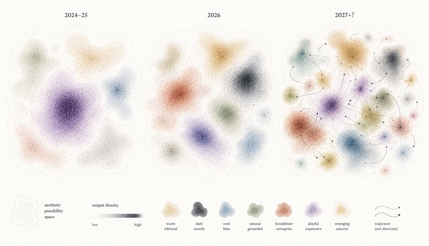
If polished versions of these validated answers become cheap and abundant, freshness may become scarcer and therefore more valuable. This helps explain why a new model can appear to have better taste simply by producing a coherent visual language outside the recognizable AI distribution. The excitement is partly about the artifact and partly about a possibility that other systems have not yet made ordinary. Surface difference alone provides weak evidence of judgment, however. A model can rotate through hundreds of style presets without responding meaningfully to product, audience, content, or purpose, while repeated choices can be entirely appropriate when several tasks offer similar reasons. The deeper form of convergence occurs when context stops exerting much influence over aesthetic decisions.
Directly rewarding novelty would recreate the dilemma. Strange navigation, arbitrary typography, and gratuitous animation can all manufacture distance from the prior; if these moves repeatedly win, the anti-default hardens into another recognizable default. The more useful standard is accountable specificity: a distinctive choice earns its place through the product, content, audience, culture, purpose, or internal logic of the artifact. One revealing test would keep much of a brief constant while changing something that should matter aesthetically. If a toy company becomes a hospital, the audience shifts to first-time smartphone users, or promotional copy becomes emergency information, which decisions does the model revise, which conventions does it preserve, and can those changes be explained by the new situation? Distance and direction from the prior remain a useful lens here. The important question is whether the situation gives the model a reason to move.
The most interesting future UI model may have no single best style. Its taste would appear when a usually successful answer has become wrong for this artifact, when familiarity still serves the user, and when the situation justifies searching in another direction. Current research increasingly shows how to reduce visible defects, improve visual correspondence, optimize a stated preference target, and refine an artifact from rendered feedback. The harder open problem is whether a system can preserve enough aesthetic possibility to recognize that the most rewarded region of its distribution is sometimes the wrong place to stay.
This article has stayed with the most visible dimension of generated UI. An interface can show mature aesthetic judgment while containing wrong information, broken behavior, confusing interaction, fragile implementation, or revisions that destroy earlier work. A companion post, What Makes Generated UI Good?, takes up the other qualities hidden inside the claim that a model is “good at UI”: what evidence each one requires, and who holds the standard it is checked against.
References
- OpenAI. (2026). GPT-5.6: Frontier intelligence that scales with your ambition. GPT-5.6: Frontier intelligence that scales with your ambition (OpenAI, 2026) paper
- Kimi Team. (2026). Kimi K3: Open Frontier Intelligence. arXiv Preprint arXiv:2607.24653. Kimi K3: Open Frontier Intelligence (Kimi Team, 2026) paper
- Anthropic. (2025). Improving frontend design through Skills. Improving frontend design through Skills (Anthropic, 2025) paper
- Wathan, A. (2025). Post on X about bg-indigo-500. Post on X about bg-indigo-500 (Wathan, 2025) paper
- HTTP Archive. (2025). Generative AI. In Web Almanac 2025. Generative AI (HTTP Archive, 2025) paper
- Goree, S., Doosti, B., Crandall, D. J., & Su, N. M. (2021). Investigating the Homogenization of Web Design: A Mixed-Methods Approach. Proceedings of the 2021 CHI Conference on Human Factors in Computing Systems. https://doi.org/10.1145/3411764.3445156 Investigating the Homogenization of Web Design: A Mixed-Methods Approach (Goree et al., 2021) paper
- Anthropic. (2026). Frontend Design. Frontend Design (Anthropic, 2026) paper
- Kilo. (2026). Kimi K3 Just Took the #1 Spot for Frontend. We Put It Against Claude Fable 5 on 10 UIs. Kimi K3 Just Took the #1 Spot for Frontend. We Put It Against Claude Fable 5 on 10 UIs (Kilo, 2026) paper
- Vitruvius. (1914). The Ten Books on Architecture (M. H. Morgan, Trans.). Harvard University Press. The Ten Books on Architecture (Vitruvius, 1914) paper
- Birkhoff, G. D. (1933). Aesthetic Measure. Harvard University Press. https://doi.org/10.4159/harvard.9780674734470 Aesthetic Measure (Birkhoff, 1933) paper
- Hume, D. (1757). Of the Standard of Taste. In Four Dissertations. Of the Standard of Taste (Hume, 1757) paper
- Kant, I. (1914). Kant’s Critique of Judgement (J. H. Bernard, Trans.; 2nd ed.). Macmillan and Co. Kant’s Critique of Judgement (Kant, 1914) paper
- Fechner, G. T. (1876). Vorschule der Aesthetik. Breitkopf & Härtel. Vorschule der Aesthetik (Fechner, 1876) paper
- Berlyne, D. E. (1970). Novelty, Complexity, and Hedonic Value. Perception & Psychophysics, 8(5), 279–286. https://doi.org/10.3758/BF03212593 Novelty, Complexity, and Hedonic Value (Berlyne, 1970) paper
- Walton, K. L. (1970). Categories of Art. The Philosophical Review, 79(3), 334–367. https://doi.org/10.2307/2183933 Categories of Art (Walton, 1970) paper
- Baxandall, M. (1988). Painting and Experience in Fifteenth Century Italy: A Primer in the Social History of Pictorial Style (2nd ed.). Oxford University Press. Painting and Experience in Fifteenth Century Italy: A Primer in the Social History of Pictorial Style (Baxandall, 1988) paper
- Bourdieu, P. (1984). Distinction: A Social Critique of the Judgement of Taste (R. Nice, Trans.). Harvard University Press. Distinction: A Social Critique of the Judgement of Taste (Bourdieu, 1984) paper
- Parsons, G., & Carlson, A. (2008). Functional Beauty. Oxford University Press. https://doi.org/10.1093/acprof:oso/9780199205240.001.0001 Functional Beauty (Parsons and Carlson, 2008) paper
- Hekkert, P., Snelders, D., & Van Wieringen, P. C. W. (2003). “Most advanced, yet acceptable”: Typicality and novelty as joint predictors of aesthetic preference in industrial design. British Journal of Psychology, 94(1), 111–124. https://doi.org/10.1348/000712603762842147 “Most advanced, yet acceptable”: Typicality and novelty as joint predictors of aesthetic preference in industrial design (Hekkert et al., 2003) paper
- Chen, X. A., Knearem, T., & Li, Y. (2025). The GenUI Study: Exploring the Design of Generative UI Tools to Support UX Practitioners and Beyond. Proceedings of the 2025 ACM Designing Interactive Systems Conference, DIS ’25, 1179–1196. https://doi.org/10.1145/3715336.3735780 The GenUI Study: Exploring the Design of Generative UI Tools to Support UX Practitioners and Beyond (Chen et al., 2025) paper
- Silvia, P. J. (2013). Interested Experts, Confused Novices: Art Expertise and the Knowledge Emotions. Empirical Studies of the Arts, 31(1), 107–115. https://doi.org/10.2190/EM.31.1.f Interested Experts, Confused Novices: Art Expertise and the Knowledge Emotions (Silvia, 2013) paper
- Pan, Y., Hu, C., Huang, X., Huang, C., Zhao, M., Bi, Y., Zhang, X., Zeng, A., & Hu, L. (2026). AeSlides: Incentivizing Aesthetic Layout in LLM-Based Slide Generation via Verifiable Rewards. arXiv Preprint arXiv:2604.22840. AeSlides: Incentivizing Aesthetic Layout in LLM-Based Slide Generation via Verifiable Rewards (Pan et al., 2026) paper
- Yang, Y., Li, W., Ren, H., Lu, Z., Wang, K., Huang, Z., Zong, Z., Zhan, M., & Li, H. (2026). SlidesGen-Bench: Evaluating Slides Generation via Computational and Quantitative Metrics. arXiv Preprint arXiv:2601.09487. SlidesGen-Bench: Evaluating Slides Generation via Computational and Quantitative Metrics (Yang et al., 2026) paper
- Peng, Y.-H., Bigham, J. P., & Wu, J. (2025). DesignPref: Capturing Personal Preferences in Visual Design Generation. arXiv Preprint arXiv:2511.20513. DesignPref: Capturing Personal Preferences in Visual Design Generation (Peng et al., 2025) paper
- Chen, D., Chen, R., Zhang, S., Wang, Y., Liu, Y., Zhou, H., Zhang, Q., Wan, Y., Zhou, P., & Sun, L. (2024). MLLM-as-a-Judge: Assessing Multimodal LLM-as-a-Judge with Vision-Language Benchmark. Proceedings of the 41st International Conference on Machine Learning, Proceedings of Machine Learning Research, 235. MLLM-as-a-Judge: Assessing Multimodal LLM-as-a-Judge with Vision-Language Benchmark (Chen et al., 2024) paper
- Lozhkov, A., Li, R., Ben Allal, L., Cassano, F., Lamy-Poirier, J., Tazi, N., Tang, A., Pykhtar, D., Liu, J., Wei, Y., Liu, T., Tian, M., Kocetkov, D., & others. (2024). StarCoder 2 and The Stack v2: The Next Generation. arXiv Preprint arXiv:2402.19173. StarCoder 2 and The Stack v2: The Next Generation (Lozhkov et al., 2024) paper
- Ge, T., Liu, Y., Ye, J., Li, T., & Wang, C. (2025). Advancing Vision-Language Models in Front-End Development via Data Synthesis. arXiv Preprint arXiv:2503.01619. Advancing Vision-Language Models in Front-End Development via Data Synthesis (Ge et al., 2025) paper
- Tang, Z., Zhang, X., Yuan, J., Zou, Y., Gunjal, V., Jiang, S., & Modolo, D. (2026). MM-ReCoder: Advancing Chart-to-Code Generation with Reinforcement Learning and Self-Correction. Proceedings of the IEEE/CVF Conference on Computer Vision and Pattern Recognition, 22164–22173. MM-ReCoder: Advancing Chart-to-Code Generation with Reinforcement Learning and Self-Correction (Tang et al., 2026) paper
- Yang, Z., Hong, W., Xu, M., Fan, X., Wang, W., Cheng, J., Gu, X., & Tang, J. (2025). UI2Code^N: UI-to-Code Generation as Interactive Visual Optimization. arXiv Preprint arXiv:2511.08195. UI2Code^N: UI-to-Code Generation as Interactive Visual Optimization (Yang et al., 2025) paper
- Narreddi, S. (2026). Training AI to Paint with Code. Training AI to Paint with Code (Narreddi, 2026) paper
- Deng, J., Yao, K., & Zhang, L. (2026). VisRefiner: Learning from Visual Differences for Screenshot-to-Code Generation. arXiv Preprint arXiv:2602.05998. VisRefiner: Learning from Visual Differences for Screenshot-to-Code Generation (Deng et al., 2026) paper
- Reber, R., Schwarz, N., & Winkielman, P. (2004). Processing Fluency and Aesthetic Pleasure: Is Beauty in the Perceiver’s Processing Experience? Personality and Social Psychology Review, 8(4), 364–382. https://doi.org/10.1207/S15327957PSPR0804_3 Processing Fluency and Aesthetic Pleasure: Is Beauty in the Perceiver’s Processing Experience? (Reber et al., 2004) paper
- Bornstein, R. F., Kale, A. R., & Cornell, K. R. (1990). Boredom as a Limiting Condition on the Mere Exposure Effect. Journal of Personality and Social Psychology, 58(5), 791–800. https://doi.org/10.1037/0022-3514.58.5.791 Boredom as a Limiting Condition on the Mere Exposure Effect (Bornstein et al., 1990) paper
- Carbon, C.-C. (2010). The Cycle of Preference: Long-term Dynamics of Aesthetic Appreciation. Acta Psychologica, 134(2), 233–244. https://doi.org/10.1016/j.actpsy.2010.02.004 The Cycle of Preference: Long-term Dynamics of Aesthetic Appreciation (Carbon, 2010) paper